Alette Holmberg-Nielsen | 29/04/2021
The value of simplicity in product development
Effortless, easy, uncomplicated, and intuitive experiences — simple experiences — are in high demand.
In a 2019 study conducted by Localogy, as much as 76% of small businesses said that a simpler product would increase their engagement with the software they’ve purchased, because “too many features make it difficult to use”.
In 2018–2019, Siegel+Gale — a British brand strategy company — did a study that shows how since 2009 the value of the simplest brands of publicly traded companies has outperformed the major indexes by close to 7x. Simple brands in this context are brands like Netflix, Lidl, and Uniqlo.
Siegel+Gale found that 55% of customers are willing to pay more for simpler experiences. And 64% of consumers are more likely to recommend a brand because of its simpler experience.
“In a world crowded with complexity, simple experiences stand out. Simplicity brings clarity instead of confusion, and decision instead of doubt. And the rewards are real — greater customer loyalty, more innovation among employees, and increased revenue.”
— Margaret Molloy, Global Chief Marketing Officer, Siegel+Gale
Why is simplicity hard to achieve?
To understand why most products and services end up as cluttered patchwork solutions, you need to understand human nature.
A recent study in Nature shows that people systematically favor changes that add rather than subtract when asked to improve an object, idea, or situation. When asked to solve a problem, people will fail to consider solutions that subtract and primarily consider those solutions adding to the mix.
“Across eight experiments, participants were less likely to identify advantageous subtractive changes when the task did not (versus did) cue them to consider subtraction, when they had only one opportunity (versus several) to recognize the shortcomings of an additive search strategy or when they were under a higher (versus lower) cognitive load."
— Adams et al.
In short, it’s human nature to want to add more stuff to solve a problem, despite the fact that simpler is most of the time better. When trying to achieve simplicity it’s helpful to understand what other psychological mechanisms are preventing you from simplifying. The following three laws and cognitive biases might help you realize what is at stake when you’re in a discussion about what to remove:
Hick’s law
Hick’s Law says that the more choices a user is presented with, the longer it will take the user to reach a decision. This is common sense but frequently forgotten by product managers, designers, and marketers.
The sunk cost fallacy
Sunk cost is a cost paid in the past that cannot be recovered. As such, sunk cost shouldn’t impact rational decision-making about the future. In reality, people tend to continue to invest in a venture even when it doesn’t make sense solely because they are already invested.
The IKEA effect
The IKEA effect is the “tendency for people to place a disproportionately high value on objects that they partially assembled themselves, such as furniture from IKEA, regardless of the quality of the end product.”
The inclination towards adding rather than removing, combined with the tendency to invest in extraneous solutions explains why it’s so rare to find those effortless, easy, uncomplicated, and intuitive product experiences.
How do you achieve simplicity?
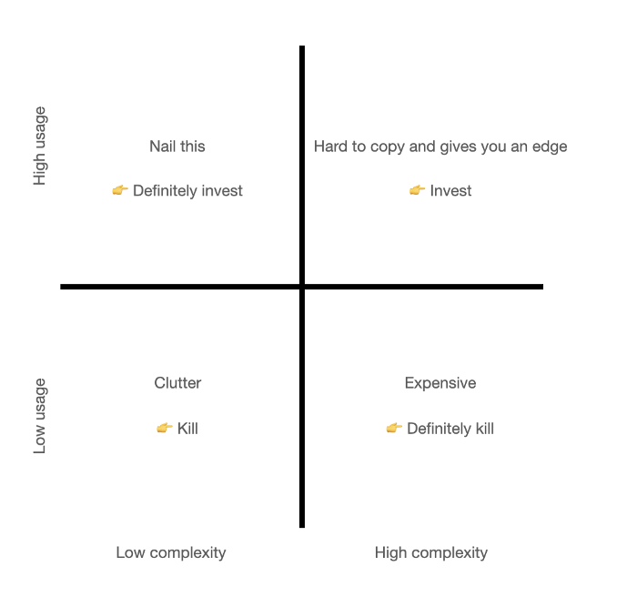
The first step to solving the problem of product complexity is acceptance. Find out how you’re doing by mapping all features or products to a usage-complexity matrix. This will reveal which and how many features you should definitely kill or invest in.

To achieve simplicity, everything with low usage and value is something that you should consider ‘killing’. Even if it’s not expensive to maintain, it might still add to your user’s cognitive load and prevent them from making the right decisions faster as pointed out by Hick’s law.
Once you know whether you have an overly complex product and you’ve identified what features to kill, here are a few things to consider:
- Once you’ve made the decision, don’t let people talk you into keeping the clutter. They will try;
- In cases where you’re trying to make something valuable and complex simple, consider using progressive disclosure (Don’t overdo it though. I can handle putting a username and a password in at the same screen);
- Make sure to clean up after testing — don’t let old inconclusive experiments run forever;
- Consider replacing the hackathons with a spring cleaning of the product, dusting off the old corners, and removing unnecessary clutter.
We can all agree with Antoine de Saint-Exupery that perfection is often achieved by removing stuff:
“Perfection is achieved not when there is nothing more to add, but when there is nothing left to take away”.
At Mono Solutions, we’re constantly working on improving our products. After 14 years of building countless products and experiences, we’ve decided that 2021 is the year where we simplify and focus on the core.
About the author
Alette Holmberg-Nielsen is VP of Product at Mono Solutions, where she helps teams, product managers and designers ship stellar products and build product culture that eats strategy for breakfast.