Mette Nielsen | 05/12/2022
Designing customer websites using The Golden Circle model
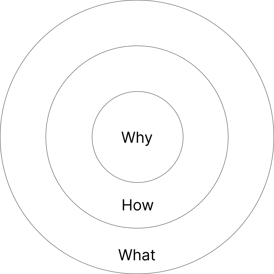
The Golden Circle model lays out how companies can communicate successfully, if they start with why.
Why does your company exist? Why do you, as a leader, get up in the morning to go to work? And why should anyone care?
Most companies cannot answer this question. They may know what they do and how they do it. But most do not know their 'why.' It is what makes all the difference for success, according to leadership expert Simon Sinek.
Simon Sinek is the author of several books on leadership, including 'Start With Why: How Great Leaders Inspire Everyone to Take Action' which first put the Golden Circle model on the radar of leaders and marketers worldwide.
The model explains why leading brands such as Apple succeed while others that offer just as good quality products don't.
What is The Golden Circle?
The Golden Circle is a model of the idea that successful leaders communicate their purpose instead of the practical reality of their products or services. Consumers care about why the company exists, their purpose: the product is just a result. The why is what makes the product desirable.
The Golden Circle begins from the middle: Why do you do what you do? How is this achieved? And what is it that you offer?

Most companies do not communicate like that. They do the opposite: They focus only on their how or their what.
A hair dresser, not using the Golden Circle, might communicate something along these lines: "I'm a hair dresser with 12 years' experience (how) and can cut your hair into any style (what). Get your hair cut at my salon."
Notice that she didn't include her purpose, her why into this communication. She only explains what she does and how she does it.
The Golden Circle model flips this approach on its head. A hair dresser using The Golden Circle might say: "I believe everyone deserves a unique haircut that fits their livestyle and personality (why). That is why I have spent the last 12 years learning everything there is to know about hairdressing (how) and offer free consultation with every appointment (what). Book an appointment now."
The difference is huge. First, the hairdresser explains why she cares about her business, and why you should care too. She wakes up every morning to give her customers what they deserve - their own unique haircut that fits their personality. Who wouldn't want that? Only after that does she go on to explain how she makes this happen, and what she offers.
The balance between purpose and clarity
The Golden Circle states that your why must be front and center of your communication. But what about other important communication tasks a website should fulfil, such as clarity?
According to UX professional and author Steve Krug, clarity is a key goal of any website. In his book "Don't make me think!" Krug observes that most websites he look at simply don't explain clearly enough what the site is about.
He writes, "The one thing you can't afford to lose in the shuffle - and the thing that most often gets lost - is conveying the big picture. Whenever someone hands me a Home page design to look at, there's one thing I can almost always count on: They haven't made it clear enough what the site is."

We also know that Call-To-Actions must tell visitors right away where to go. We need to set up the website so that visitors convert. They only convert if we offer them an invitation to act - a call to action - whether it's a shop button or a contact form, or something else.
How can we use The Golden Circle to improve our message, and create better results, without sacrifising our focus on clarity and conversions?
How does The Golden Circle translate to website content?
Let's look at Apple as an example - a company that Simon Sinek highlights as a role model in his Ted Talk 'How great leaders inspire action' about the same topic.
The first thing we see on Apple's homepage is an ad for their newest iPad. A picture of said iPad in a range of colours accompanies the tagline: Lovable. Drawable. Magical. Underneath, you find two Call-To-Actions: 'Learn more' and 'Buy'.
Notice how Apple communicates this product. Not with any specs or hard facts, but with a hidden why. Lovable or magical are words that invoke purpose. As Sinek says in his Ted Talk, Apple's why is to challenge the status quo and thinking differently. At the same time, clarity is front and centre: We see the picture of the tablet and don't doubt for a second what the product is about.
What Apple is communicating here is that their iPad is not just any other tablet. It is the result of thinking differently, of challenging the status quo. It is a result of their why.
Learning from real life customer websites
Many of our partners do a great job designing customer websites using The Golden Circle model. Here are a few examples, and why they work:
Neubau Kinderklinikum, by Sellwerk
One website we would like to highlight is www.neubau-kinderklinikum.de built by Sellwerk on Mono's white label website builder.
From the design and the name on the logo in the top left corner, it is immediately clear that this is a children's clinic. Their call-to-action is prominent above the fold (meaning you don't have to scroll the see it), and translated to English it says:
Build with us!
The future project Children’s Hospital Nuremberg with obstetrics has big plans for small patients. Help us!
They beautifully combine their why with a clear call-to-action. Their why is simple - almost so simple that one could be tempted to find it obsolete: They have big plans for for the children at their clinic. They are ambitious on behalf of their patients' wellbeing long term.
Do they really need to state this? Isn't it just common sense? Maybe! But consider what would happen if they left out their why and instead said: We currently take donations to improve our clinic. Help us.
It just doesn't have the same power to it, right?
San Gakbu Eggs, by Yellow Malta
Let's look at another example: www.sangakbueggs.com, built by Yellow Malta (also built on the Mono editor). They decide to focus on a key market differentiator first and foremost: that they deliver daily. This works well in conjunction with their why which becomes clear when you read the rest of the paragraph:
"We at San Gakbu Farm provide our customers with daily fresh eggs deliveries throughout Malta. We have over 15 years of experience in the field — a dedication that was passed down from father to sons throughout the years."
They start with their what, as most companies do, but quickly move on to their why: "A dedication that was passed down from father to sons throughout the years."
As consumers we quickly create the link between fresh produce, family owned farm and the values that are tied to this: That of a smaller scale production, quality over quantity and local, small business, versus a factory farm.
They manage to communicate their why early enough to have a powerful impact. They also communicate it well in the sub-text around their key selling points: "San Gakbu farm delivers fresh every day."
Style Victims, by Heise Media Service
Another great example is www.style-victims.de built by our partner Heise (also built on the Mono white-label website builder).
Style Victims is a cookie cutter example of a Golden Circle website:
- The headline is their why: "Be unique, not well-behaved". Their purpose is to provide you a way to stand out and be your unique, edgy self in the world.
- The next line explains their how: "Find your style". This is how they help you achieve this uniqueness, by helping you find your personal style.
- The third line explains the what: "Current fashion trends & individual style advice for every type". This is what they actually offer.
Style Victims don't just sell clothes. They sell a way to express individuality.
Implementing the Golden Circle consistently on your own customer websites
You don't always get a lot of control over the content on your customers' websites. Your customers often have their own ideas of what words should be used, and what should be the main Call-To-Action. But often, they will also listen to your advice as a website reseller. Additionally, much can be achieved from visual communication. As we saw from the above examples, a customer's why can also be communicated through the placement of the content, images and Calls-To-Actions. Even though words are important, it is also the holistic impression of the home page that conveys the message.
Here are a few questions you can ask yourself when setting up a customer website:
- Is the opening statement on the website centered only around what product or service is offered, or is there also an essence about why the company does what it does?
- Is it clear what the site is about, if you only look at the homepage?
- Is there a prominent CTA above the fold (without having to scroll)? And is this CTA tied back to the customer's company purpose (Their why)?
- Is the why something your customer might think is obvious, and thus not communicated overtly on the website? Is there a way to more openly communicate what their purpose is?
Wrapping up
We hope these tips were useful for you and that you can use some of them next time you build a customer website. Simon Sinek's Golden Circle is a handy tool when deciding what should be communicated on a website, and how. But of course, a lot more than that goes into building a successful customer website. If you would like more insight into what a small business might need to successfully launch their online presence, check out this article: What do businesses need to be successful online?
About Mono
Mono believe small businesses deserve the same level of online presence and performance as larger companies. With Mono white-label website builder, we provide website resellers with an all-in-one solution to build and manage hundreds or even thousands of customer websites, specifically designed with the SMB end-user in mind. Get a demo here.