Mette Nielsen | 14/08/2024
Building Websites at Scale: Real-World Examples and Best Practices
6 real-life examples of how design businesses and design agencies build websites at scale from the Best Website Competition 2024.
We recently announced the winner of our annual Best Website Competition: a competition to find the best website designer among our partners.
Our partners are website resellers who specialize in building websites at scale. Some of them are directories, others are design agencies, telcos or other kinds of design businesses. We are always impressed by the stunning, creative websites they produce for their SMB clients, showcased in the competition.
These websites are a great study of how professionals create websites at scale – without compromising good design, content and overall website quality.
Let’s dive into these real-life examples, identify what the designers did well, and uncover best practices you can apply to your own projects.
What makes building websites at scale challenging?
When B2SMBs build websites at scale, the goal is to produce a large number functional, professional, and results-driven websites quickly.
At the same time, the website needs to look professional, load quickly, appear trustworthy, and follow all the expected industry standards.
Striking this balance between quality, function and efficiency is a unique challenge to professional website resellers.
Building Websites at Scale: Best Practices
The examples we are looking at today come from our Best Website Competition – an annual competition where we find the best website built on the Mono Platform the previous year.
We consider a range of website best practices when determining the winner of the Best Website Competition. Here, we will explore what those website best practices are, so you can use them for your own website projects. And to explain why the Six Finalists made it to the final rounds.
Performance:
First and foremost, we evaluate the website's performance according to Google Pagespeed Insights. Great performance is massively important to the website's overal score, and that is because performance is so important in the real world. If a site loads slowly, or if it's not properly optimised for mobile, it does not provide a good customer experience in the real world.
Customer experience:
Next, we assess the customer experience. This includes how easy the site is to navigate. Is the navigational menu easy to use, and is the content arranged in a user-friendly manner with the most important content easily accessible? Does the website answer the questions a visitor would have, and are they guided with strategic CTAs to do the desired action?
Trustworthiness
We also look at the site's trustworthiness. Key indicators of trustworthiness are the clear visibility of the logo and company details, ease of contacting the company, and the presence of an "About" page. Compliance with GDPR, indicated by a cookie banner, is also a significant factor in establishing trust.
Design
Finally, we examine the design. We consider whether the website is visually appealing, if the designer has demonstrated creativity, and if the site adheres to industry best practices for design. A SMB website must first and foremost be functional and results-driven – but a design is also an important part of the business’ branding, and it can mean a lot for how visitors’ view the business. Additionally, a creative, unique design can make a business stand out and be memorable.
Building websites at scale examples
Let’s look at the top 6 finalists - and the winner of course - of the Best Website Competition and discuss why they did so well in the competition.
The Winner of the Best Website Competition:
Hundested Rørvig
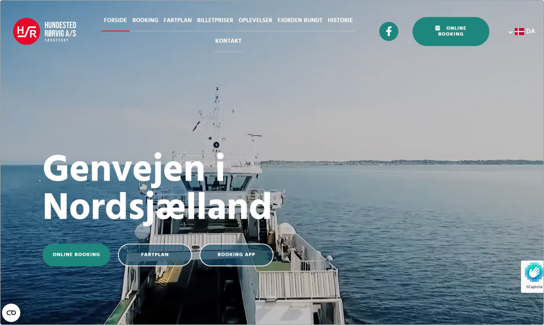
Hundested Rørvig by Robin won the Best Website Competition, thanks to a well-executed design and great performance that creates a results-focused digital presence. The designer implemented several effective strategies to achieve this.
The website features prominent CTAs (call-to-actions) above the fold and contact information boxes on every page. For SMBs, guiding visitors to take specific actions is important, and placing these elements above the fold makes sure that visitors are directed to them quickly without needing to scroll.
The website appears trustworthy as well; we don’t for a moment doubt that this is a legitimate website. The logo and business name are clearly visible, and what they do is clearly communicated right away. The site communicates who the business is, what it does, and what visitors can achieve on the website. The cookie banner promises a SMB who is committed to respecting and protecting the visitors’ data choices, further enhancing their trustworthiness.
The website is aesthetically pleasing, with high-quality images and a well-organized layout. While the text could benefit from being broken into more sections or interspersed with additional images to avoid creating a "wall of text," the overall appearance is clean and inviting.
Key design features include:
- A high-quality and on-brand video background, not only creating visual interest but also communicating what the business is about.
- Each page features engaging headline animations when loading.
- The red click effect on the menu results in a userfriendly and visually appealing user experience.
- While the layout uses a lot of squares and rectangles, it doesn't feel overly boxy due to varied page designs and effective use of images.
- Dropdown lists in the menu provide additional information and maintain a clean look.
- "Driftstatus" Notification: This animated notification adds a touch of interactivity.
- Historical information dropdowns offer detailed histories of various boats, enriching the content and adding to the trustworthiness of the site.
While there are flashier websites, Hundested Rørvig stands out because the designer kept an eye on the goal: translating a wealth of content into an easily understandable format that guides visitors to take the desired actions. This results-oriented approach is what made the website a winner.
The finalists of the Best Website Competition
In no particular order, let’s look at the 5 other finalists in the Best Website Competition.
Pappas donuts
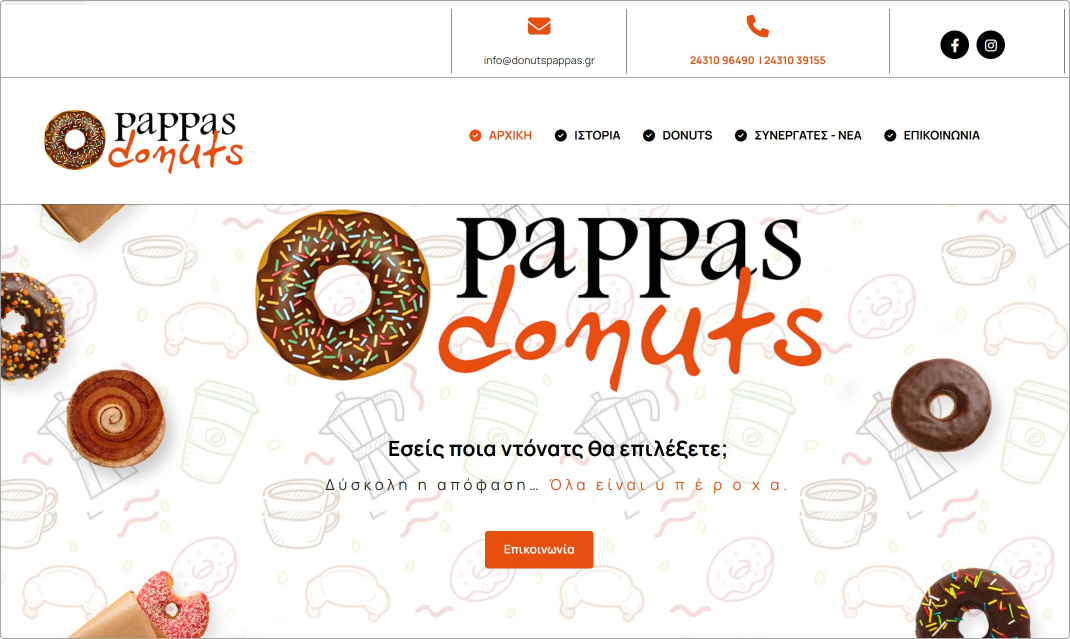
The design details on Pappas donuts by Greek Yellow Pages create a whimsical and joyful impression, with an impressive level of craftsmanship. The use of black lines lends a nostalgic touch, while the crisp graphics and playful fonts provide a modern contrast. The button animations, featuring black and orange, are well-executed and add visual interest. However, the overall structure of the page could be improved. The many details sometimes is a bit confusing and can make it difficult to distinguish the different sections from each other.
The design effectively reinforces the website’s branding, making it clear who the company is regardless of where you are on the site. The logo and cookie banner enhances trustworthiness, while the top ribbon and social buttons offer opportunities for engagement.
The partner page, which lists where to buy the donuts, is informative but could be more prominently featured or highlighted as a call to action. This would clarify the desired visitor actions and potentially drive more traffic to the partner shops.
Qltivation AS
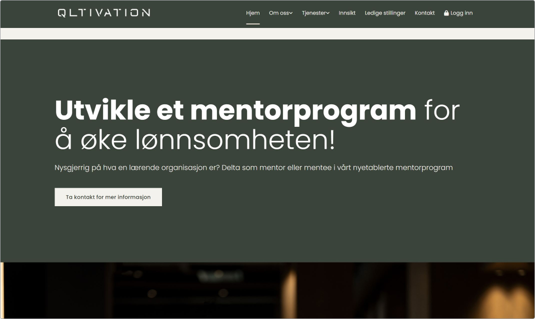
The Qltivation website by Hjemmesidehuset is well designed both when it comes to aesthetics and functionality.
The website loads quickly and smoothly. It features an intuitive menu: clear and well-organized, allowing visitors to find information easily.
The website features clear branding with the logo prominently displayed, reinforcing brand identity and trust. The contact details are easily accessible, with a dedicated "Contact" page providing multiple ways to get in touch. A comprehensive "About" page builds credibility and trust with visitors. The presence of a cookie banner ensures compliance with GDPR, signaling to users that their privacy is taken seriously.
The designer has created a clean, modern website design with a professional green color scheme that reflects the brand's identity. The horizontal layout feels intuitive and easy, but also professional and straightforward. Strategic use of whitespace prevents the site from feeling cluttered. Professional and high-resolution images enhance the visual appeal and convey a sense of quality.
When it comes to creativity, it can be difficult to find a balance between creativity and professionalism. But they have achieved it here; the dark green color scheme stands out from the blues we would normally see in a consultancy. The pink background color, with green on top, provides an interesting color combination that still fits with the industry. Together with the large, soft fonts, this website feels serious but also playful and modern.
The use of interactive elements, such as animations and hover effects, engages visitors without overwhelming them.
Effective CTAs are placed strategically throughout the site, guiding visitors toward desired actions, such as contacting the company or learning more about services.
Qltivation's website stands out due to its high performance, excellent customer experience, and visually appealing design. By focusing on intuitive navigation, trustworthiness, creative design, and high-quality content, the website designer has created a digital presence that effectively serves its audience and achieves its business objectives.
Burnap + Abel
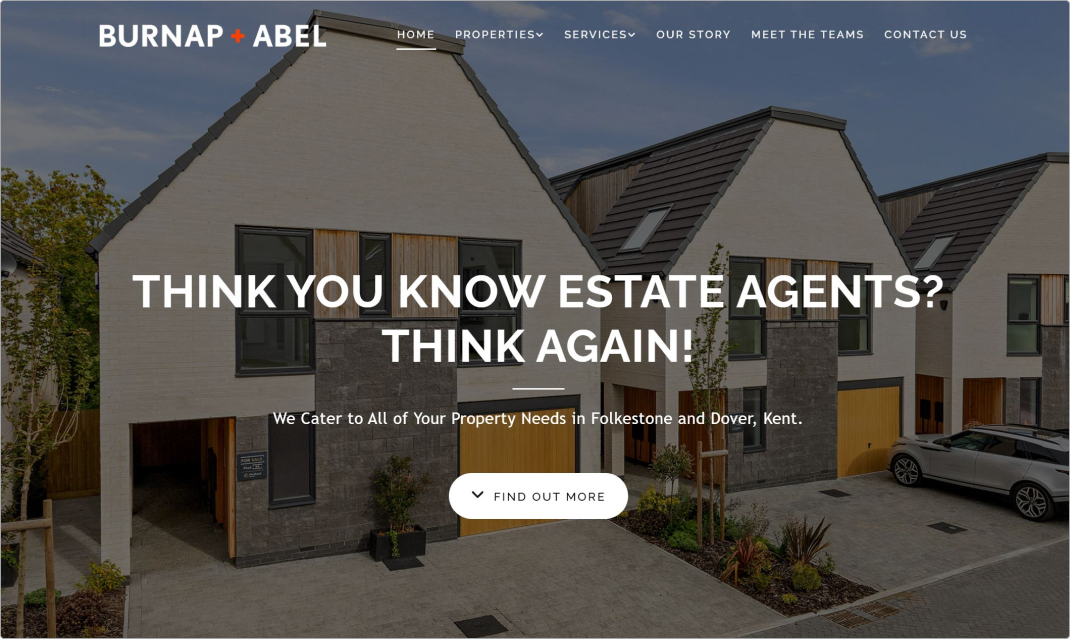
Burnap + Abel by Reach PLC could have been just another boring real estate site, but it is far from it. The peachy color palette and soft design immediately catches the eye and sets it apart. It’s unique and refreshing to look at, making for a memorable experience. Using a dark filter over the background image in the title section allows the title and logo to stand out brightly – letting the image play a supporting role while letting the bold fonts and message shine.
Much like the other finalists, this website has done branding and trustworthiness right, with prominent branding elements, meet the team page and cookie banner. The content is structured in a user-friendly way: services are listed out as sub-menu points. This is a website with a lost of information, including property listings, but the information never feels overwhelming and it’s clear how to find what you need.
Call to actions (CTAs) are placed strategically across the site, one before the fold and again after each content block. The only weakness here is that the first CTA could have been a bit stronger. Instead of ‘Find out more’, taking the visitor down to the next section, they could have had two buttons next to each other with more immediate actions, for example: ‘Sell your home’ and ‘Buy home’.
The buttons are animated beautifully in black and white, adding to the clean, sharp aesthetic of the website.
Røreksperterne
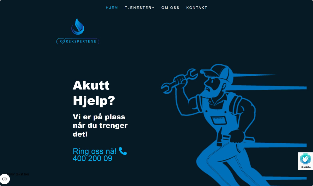
Røreksperterne by Gule Sider features a bold yet well-executed decision to keep the color scheme and design extremely simple. The choice of black, white, and blue is daring but pays off by being unique, memorable, on-brand, and aesthetically pleasing.
By choosing this striking color palette and meticulously crafting custom graphics, the designer has transcended the limitations of standard CMS templates. The site evokes the dark, watery, and flowy daily life of a plumber or "pipe-expert."
The pleasant blue tones is consistent with the client's industry, making the website uniquely suited to them. The site embraces its unique visual impression, steering clear of other white space designs more commonly seen online.
The clever use of blue and white wave dividers creates clear and manageable sections throughout the website. This structure aids in skimming content while ensuring the important information stands out. The bold font and concise text further enhance simplicity and clarity, effectively communicating key messages without overwhelming visitors. Each service is highlighted in its own blue and white box, making it easy to navigate and understand the offerings.
The CTA "call this number" is prominently placed above the fold, in the footer, and under the services on the services page. While it could be argued that including the CTA after each service might have been beneficial, the simplistic design choice of placing it in key areas still works well. Additionally, the contact link in the menu could be improved if it were a button.
In terms of trustworthiness, the branding is spot on. The design results in a unique visual identity, giving the impression of a company that knows who they are. The inclusion of the phone number and the cookie banner further enhances the website's credibility and trustworthiness.
There is something slightly off about the layout in the hero section and the menu. A slightly better balance between the elements here – perhaps mixing the big bold fonts with smaller fonts to create visual contrast – could have been a good choice.
Oslo snø og vedligehold
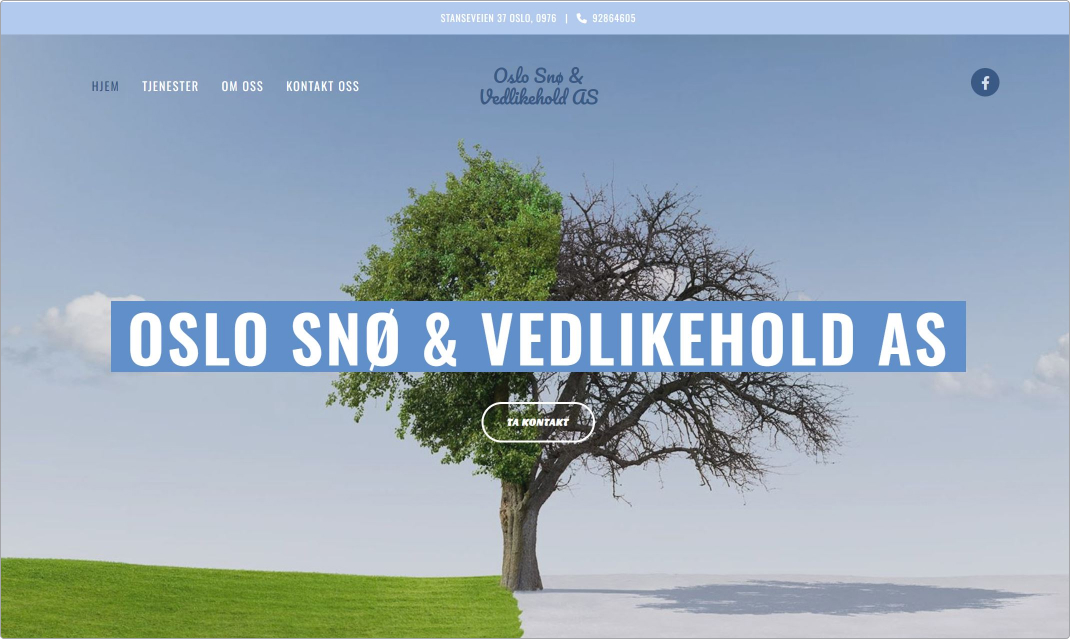
Building websites at scale presents unique challenges, particularly when addressing the specific requirements and limitations set by clients. For example, Oslo Snø by Gule Sider, a small business specializing in outdoor maintenance for both summer and winter, requested a five-page website. This constraint can be difficult to work within, especially if there is more content that could be included.
To address this challenge, the designer for Oslo Snø creatively split the website design down the center, showcasing a summer theme on one side and a winter theme on the other. This innovative approach effectively communicates the company's services at a glance without the need for additional pages or sections.
Much like the bold design choices made for Røreksperterne, Oslo Snø's designer opted for a striking block design that stands out visually compared to other websites with more white space. The use of a blue block behind the hero text not only ensures legibility but also complements the modern block design. The large font size further enhances this visual style.
Additionally, Oslo Snø's website instills trust through its clear branding and the inclusion of a cookie banner. The prominent CTA above the fold encourages visitors to get in touch.
The contact banner at the very top ensures visitors always know where to go if they wish to take the next step.
Overall, the designer's clever and bold choices result in a visually appealing and functional website that meets the client's requirements while effectively conveying the business's dual seasonal services.
It would have been nice to see more consistency in design and content across the websites – some places seem a little unfinished, for example under services where it says ‘more information to come’ in each section. The footer also feels a little under designed compared to the beautiful design that you see when first entering the site.
Final thoughts
In summary, the Best Website Competition showcases how building websites at scale involves unique challenges, such as maintaining high design quality and functionality across numerous projects. The top finalists demonstrate best practices by balancing creativity with efficiency, ensuring high performance, intuitive navigation, and strong branding. Their success highlights the importance of clear CTAs, trustworthiness, and a user-centric approach. By applying these strategies, you can overcome the complexities of scaling website development and create impactful, well-designed sites that effectively serve diverse business needs.
To see the full Best Website Competition showcase from this year and previous years, please visit our Website Inspiration page.